Archdiocese of Los Angeles
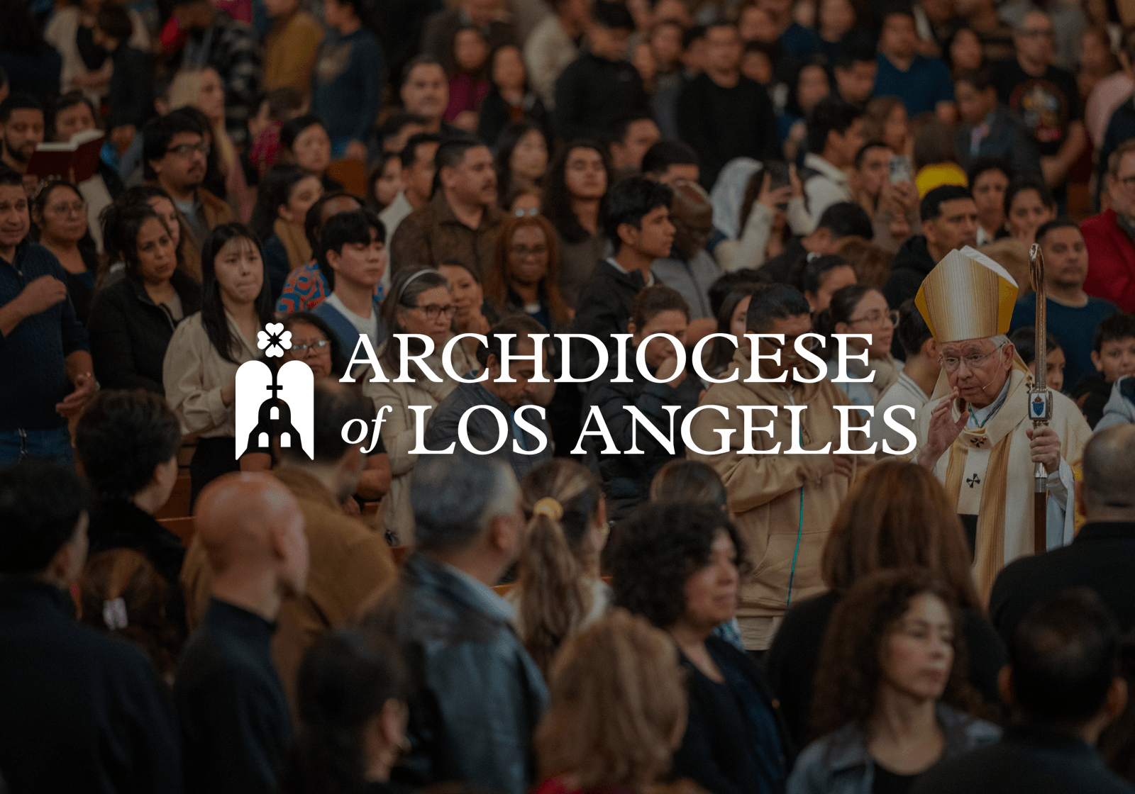
The Archdiocese of Los Angeles approached me to refresh their visual identity at a pivotal moment of transition, as they prepared to enter a new chapter marked by the Jubilee Year of Hope and a move into a new administrative space. They were seeking a system that honored their deep historical roots while feeling unified, renewed, and relevant across both formal communications and modern, media-facing platforms. The goal was to create an identity that could faithfully represent one of the most diverse Catholic communities in the world.
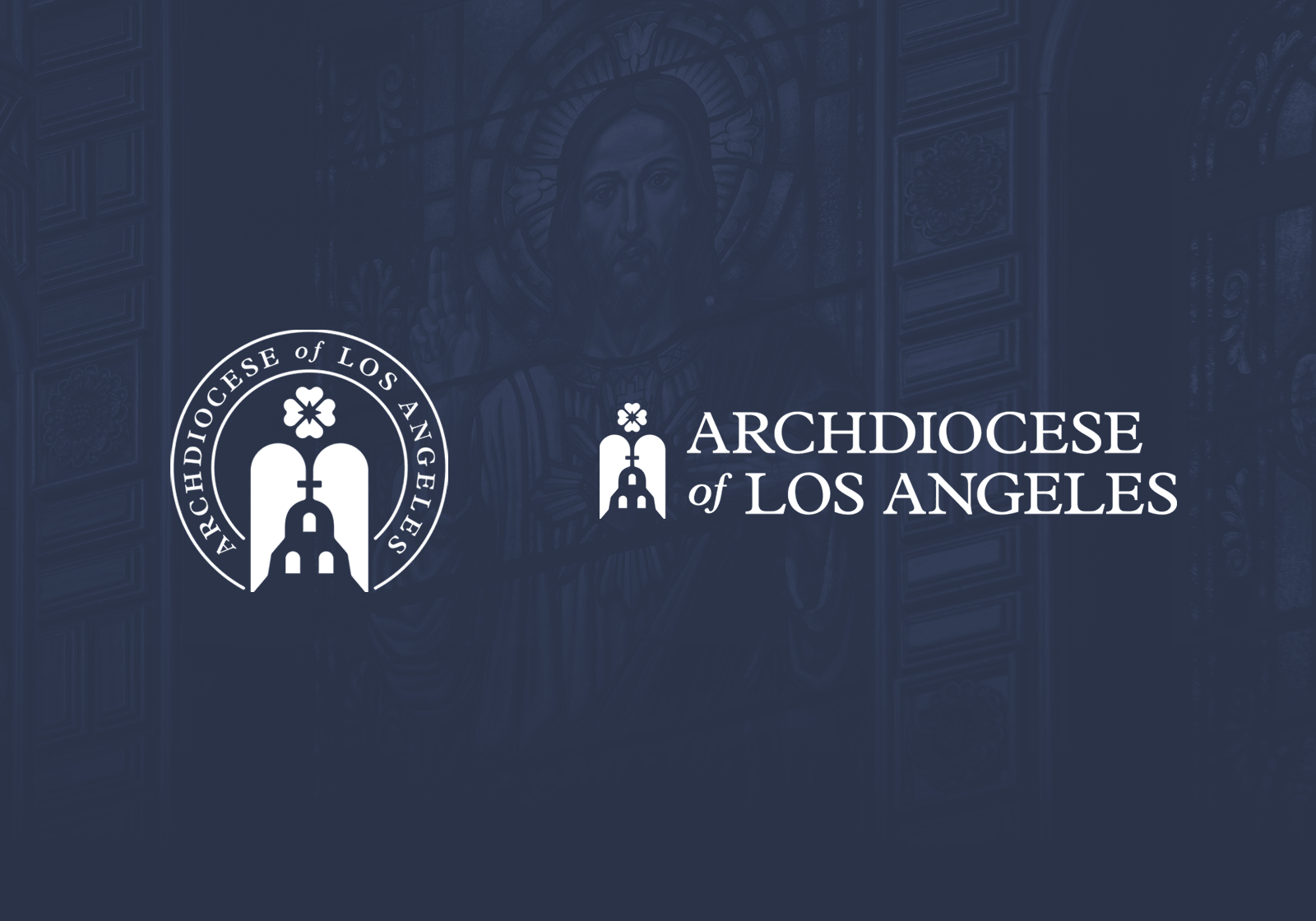
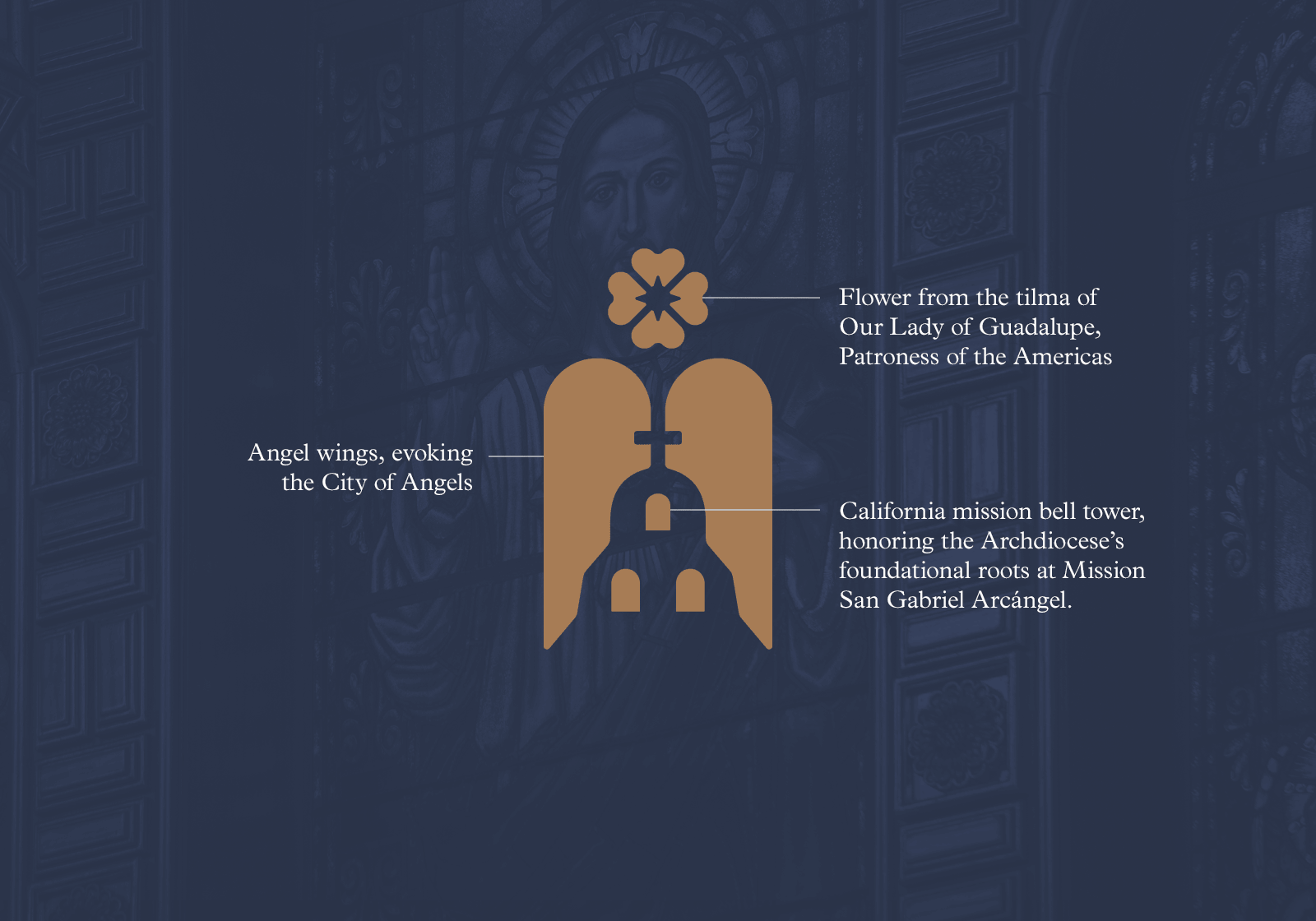
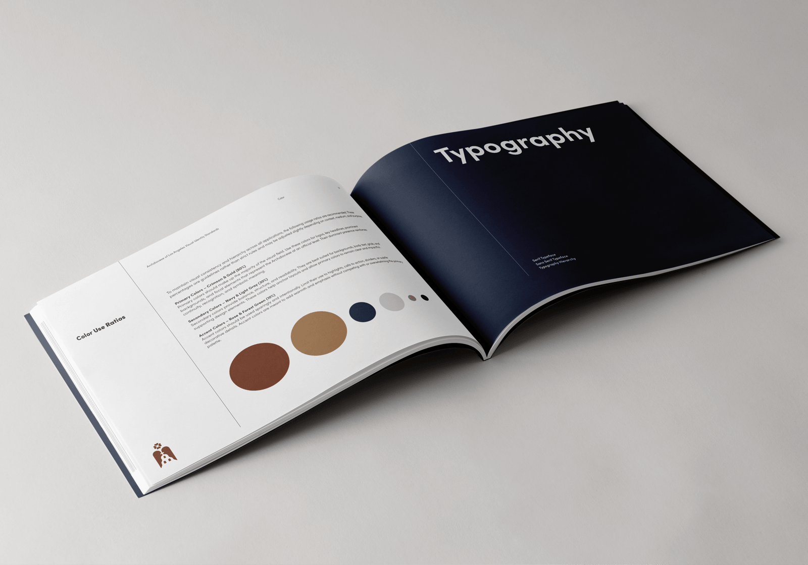
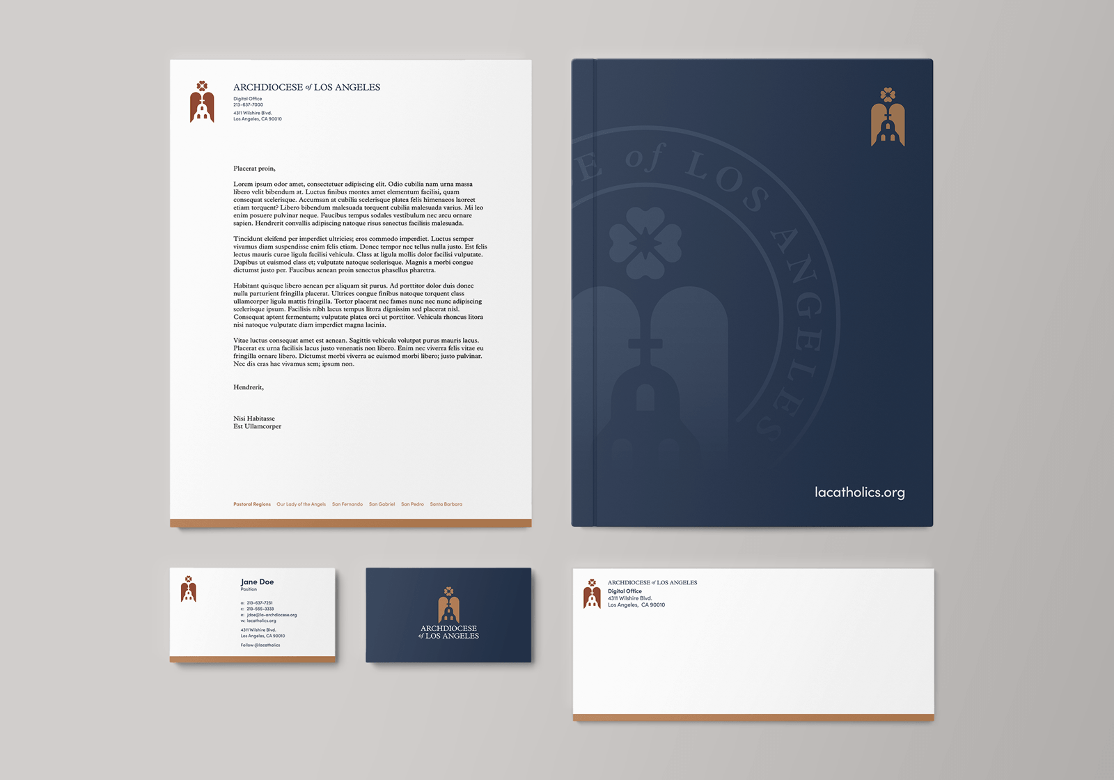
The resulting identity draws from a rich interplay of theology, history, and place. The logomark integrates symbolic elements rooted in the Archdiocese’s heritage, including references to Mission San Gabriel, the City of Angels, and the tilma of Our Lady of Guadalupe. The color palette takes inspiration from sacred visuals and Los Angeles landmarks, pairing warm, reverent tones with grounded neutrals to reflect both spiritual depth and cultural context. Typography and supporting elements were developed to create a system that is flexible yet consistent. All of this combined to form a cohesive visual language that is both meaningful and enduring.
SERVICES DELIVERED
Creative Strategy
Logo System
Color Palette
Typography
Stationery Set
Full Brand Guide